

YourTempo
Product: iOS app
Scope: End-to-end mobile app
Responsibilities: User research and testing, branding, visual design
Timeline: October 2023 (80 hours)
Background
In the modern era, the average person has a packed schedule. Trying to balance a job or career, a social life, relaxation, and health can be a lot but is also what is a societal expectation. With this immense balancing act also comes problems with how to balance things in a way that doesn’t compromise one’s mental health. YourTempo is an app intended to help anyone with their day-to-day life and live happily while still being able to manage all their responsibilities. The main draw of YourTempo is the routine assistant, who helps users move time around in their schedules and offers advice based on reported feelings and moods in a daily check-in.
Research
Problem
The average person has a packed schedule every day and with rising external pressures from different avenues, there is bound to be a significant amount of stress and anxiety. With so many being entrenched in their busy lives, people need outside help to lead happier and healthier lives.
Mission
We want to know how users manage a busy schedule by themselves and how different schedules can affect mood and mental health.
Methods
User surveys
User interviews
Competitive analysis
Synthesis
Affinity mapping
Creating personas
HMW & POV statements

An example of a persona created using the research findings
Laying the Foundation
Feature Set Creation
Knowing that users were interested in the concept of the app, there were a lot of ideas floating around. Creating a feature set and sorting features based on impact and needed resources allowed me to really focus on what would be needed in the immediate future. Users even came to me during research with their own ideas, some of which were listed in the feature set but were unfortunately had to be put on a lower priority.
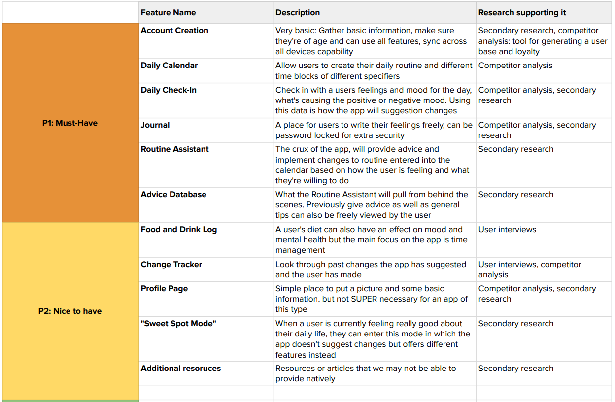
A portion of the feature set created
Task and User Flows
Time management apps definitely have a space in the mobile market, however, many of those apps create their own ways of navigating the experience. Since there are no standardized flows to use as a basis, it was up to me to create flows from scratch that would be intuitive and successful. Task and user flows were focused on the experience of setting up a user’s daily routine in the app as well as how the routine assistant would help to implement changes.

Wireframing
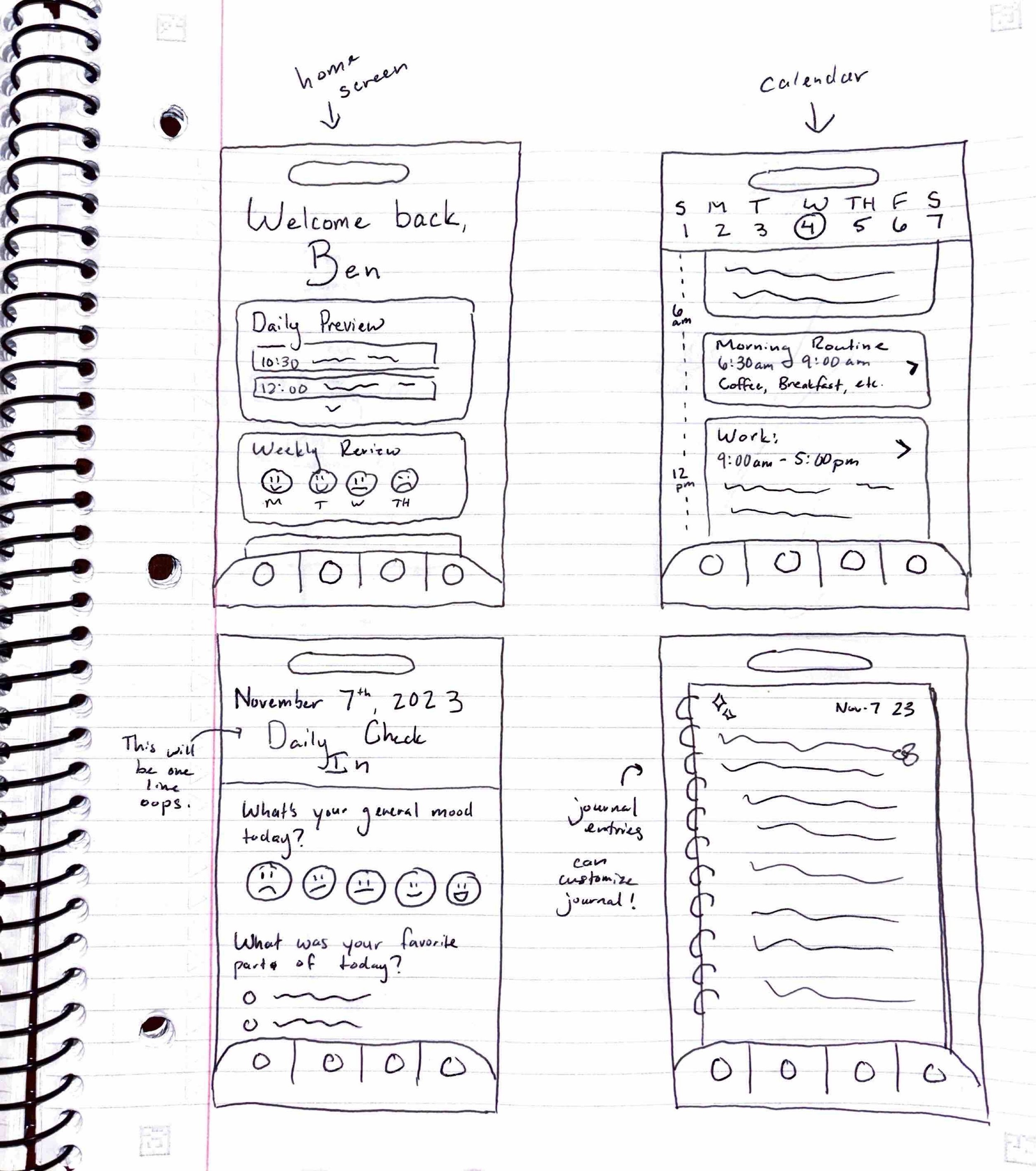
Low-Fidelity Wireframing
Going into the wireframing stage, I knew I wanted to create something that had some charm to it and felt rather “gentle”. After all, this app’s intent is to help those who are stressed and overwhelmed. Rounded edges and clean sections were my go-to to relieve any visual harshness
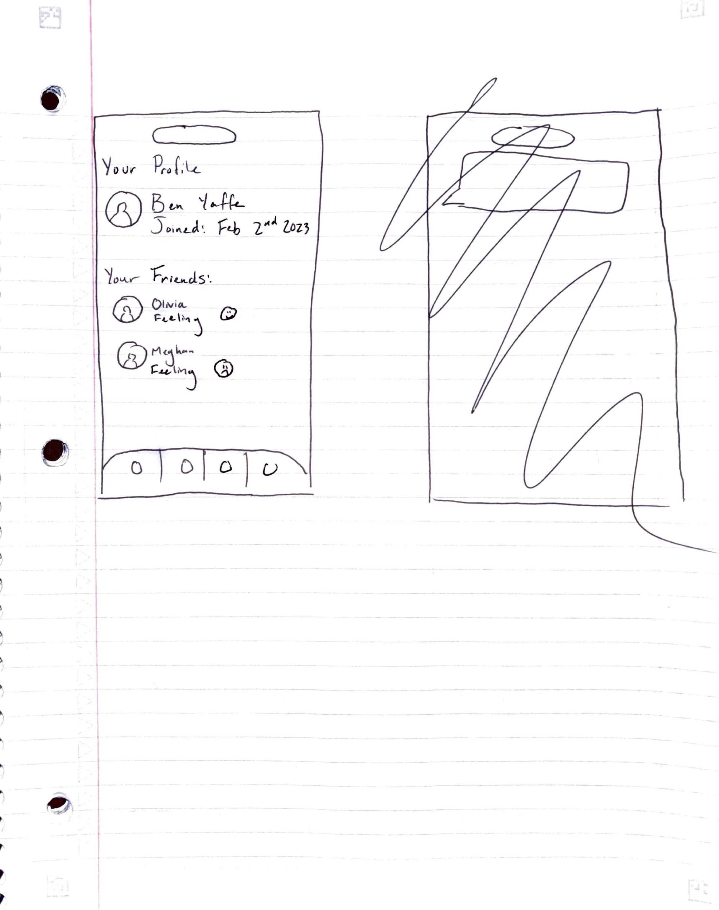
Mid-Fidelity Wireframing
Feedback given on the low-fidelity wireframes was just what I was hoping for. Some even said the app felt familiar because it reminded them of other calendars they’d used before and liked. I was in the clear to begin digitizing the low-fidelity wireframes.
Branding
Logos, Text Sets, and Color Palettes
As the sole designer, I brainstormed and created the brand identity for the product as well. I rather quickly settled on a palette centering around purples, focusing on the pastel version. Purple is often associated with royalty and richness, but a pastel purple can evoke a dreamy vibe. It is also used frequently with cleanliness and bedtime routine products (and bedtime is an important part of everyone’s routine!).

Prototyping & Usability Testing
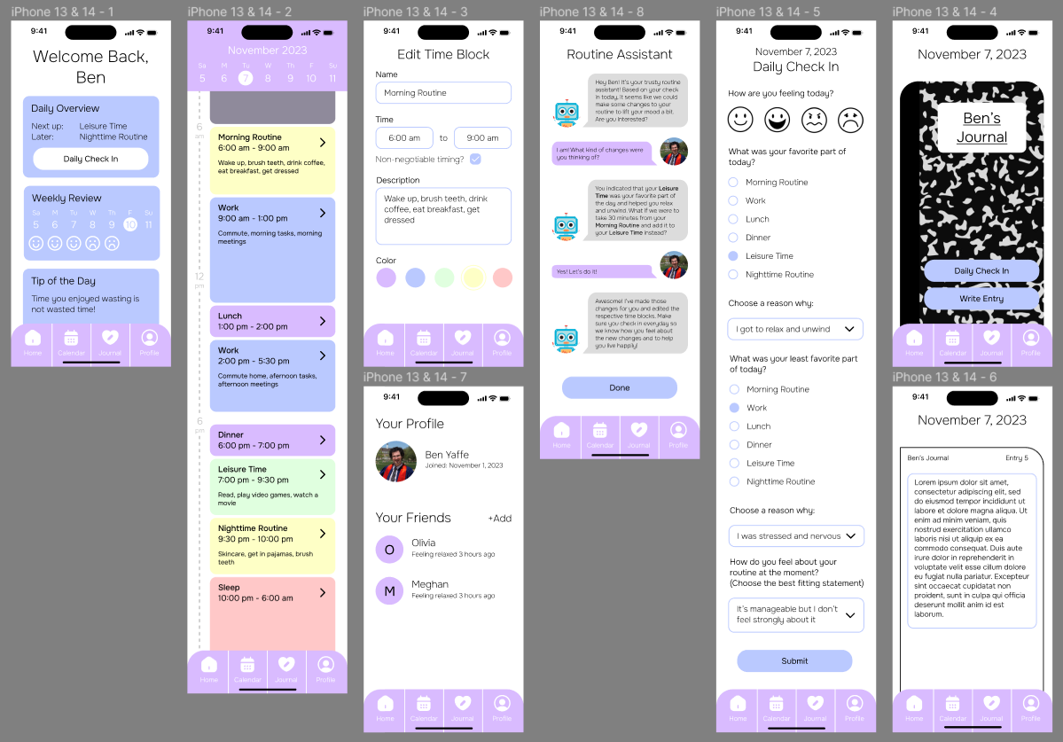
High-Fidelity Wireframing
After adding the color and branding to the mid-fidelity wireframes, we now had our high-fidelity wireframes. I was particularly proud of these, I felt they were very inviting and made the application look fun and enticing. I believe that I was also able to deliver the gentle feeling I wanted the app to give, through the cute robot avatar of the routine assistant, a familiar composition notebook journal, and the light colors.
Usability Testing Results
After conducting usability testing with 5 participants, all of whom were in the target demographic, we received significant and actionable feedback that was instrumental in making changes in the final revisions. Recommendations were made on what the most high-impact, resource-efficient changes would be. The major themes for the feedback on this project were as follows:
Not enough navigation on the journal entries screen
Desire for multiple calendar views (monthly, yearly)
Desire for more information viewable on calendar time blocks (duration, location)
A freeform notes functionality for the daily check-in
Enjoyment of the visual style and cleanliness
Enjoyment of the routine assistant
Enjoyment of the non-negotiable timing option for each calendar time block
Final Revisions
With the usability testing results analyzed, common themes pulled out and highest impact changes identified, final revisions were able to be made. These changes, as seen below, are:
Changed home screen widget color
Unified font color on home screen
Decreased size of footer navigation bar
Added duration on each calendar time block
Darkened selectable colors for time blocks
Increased text size for chatting with the routine assistant
Added a pop-up that details any changes your routine assistant made to your calendar
Added more navigation to the journal entries
Added a notes section that can be freely filled in on the daily check-in

Takeaways
As of now (November 2023) this is the most recent project that I have worked on and the one I am the most proud of. Not only did I come up with the idea for the application on my own, but I also think I did a fairly good job of realizing the concept and can see it being something people use to improve their lives on a daily basis. I’m also proud of the visual design for the product. It got great feedback in usability testing and I believe the visual style of the app is one of my most appealing designs. Creating and designing products that can aid anyone’s life, even in small ways, energizes me the most to continue designing and I hope to continue to grow my skills constantly by designing for the user and the life they want to live.